The Dempsey Challenge Rebrand Design
Nobody beats cancer alone. It takes a team.
For one weekend every September, thousands of people break out their inner athletes to raise funds to improve the lives of people living with cancer. 100% of the funds raised by The Dempsey Challenge provide programs and services at no cost to the people impacted by cancer.
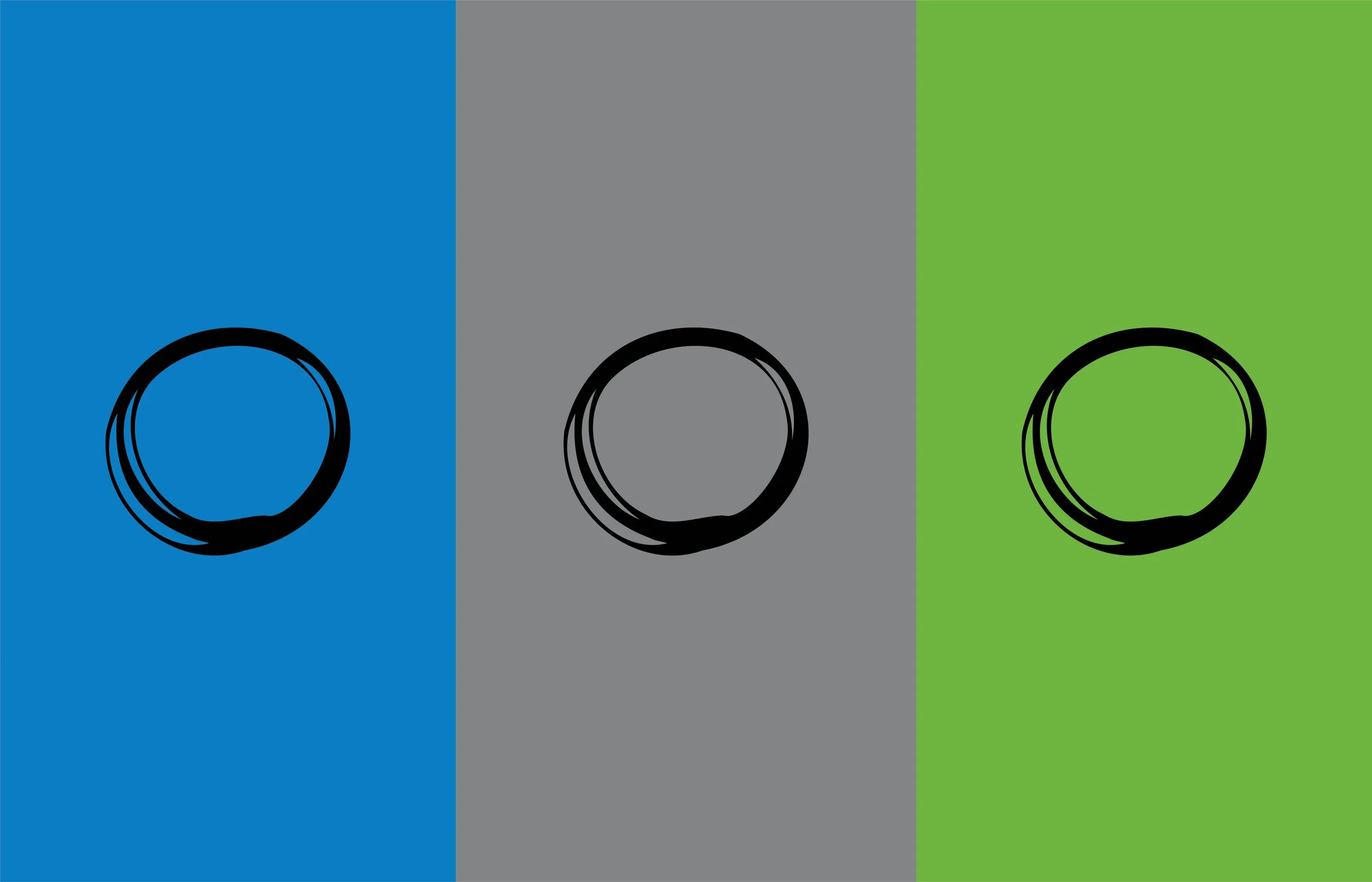
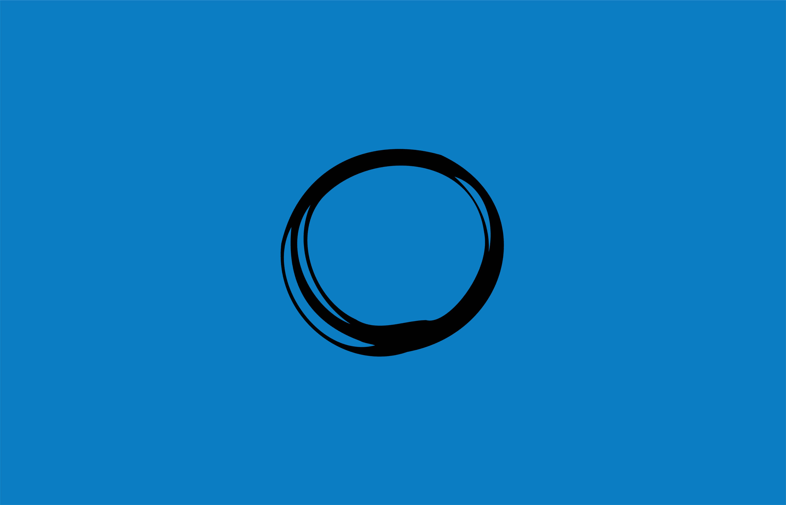
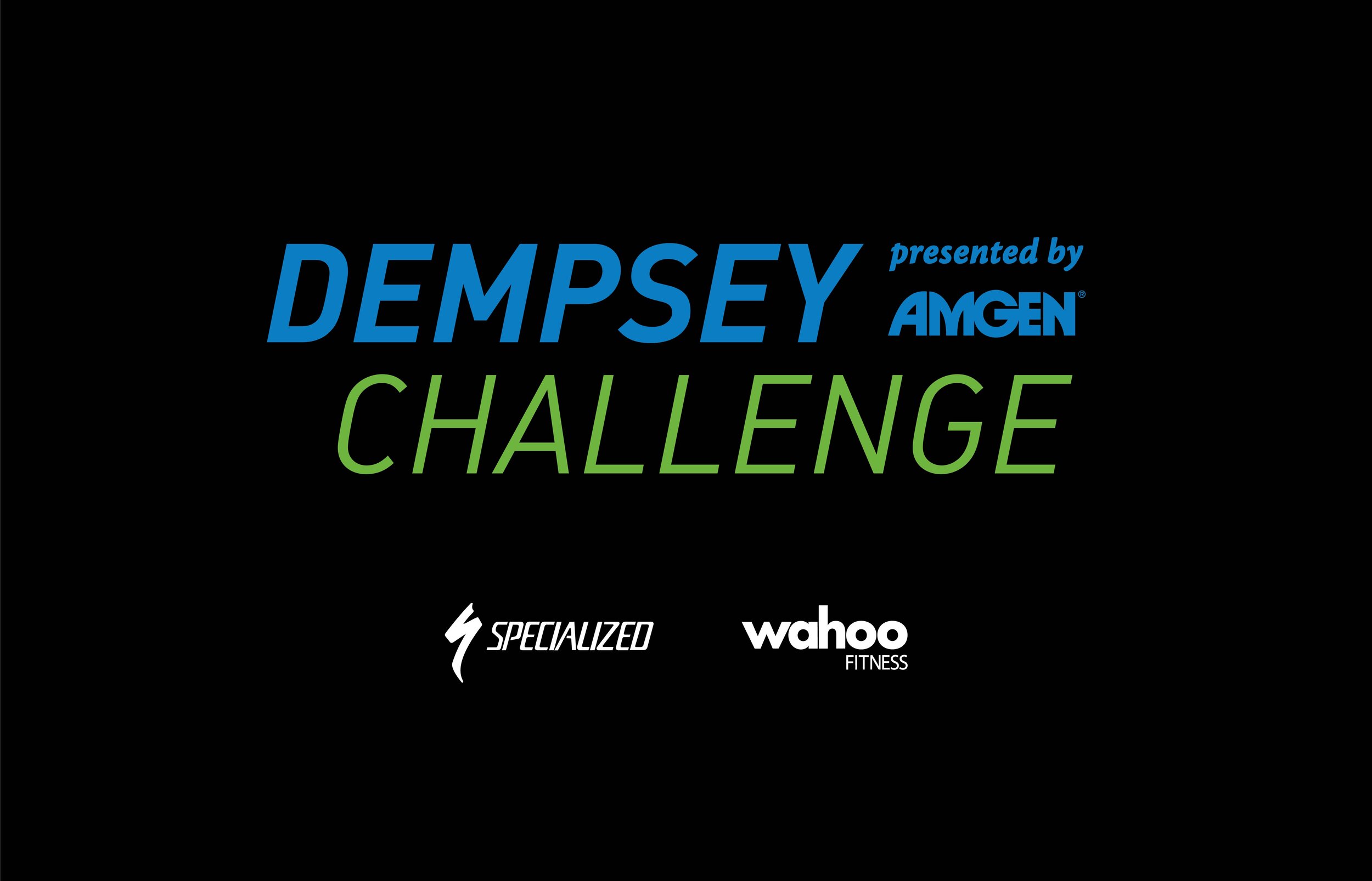
The Dempsey Challenge liked their brand but needed an update. They wanted to keep their brand colors and explore a more approachable icon and active typeface. We tried multiple directions and design solves but ultimately landed on a simple circle icon representing unity and togetherness. As for the typeface, we found a font family that had more variations to allow for a logotype that represents action and movement. These two brand updates allowed the new brand to move forward for many years to come. Not only did the brand refresh need to be presented locked up with the icon, it also needed to be versatile stacked, on one line and centered to allow for the various needs of branding including business cards, apparel, swag, sponsor backdrops, race day needs and more.
Art Directed, Designed and Created in partnership with Kirk Erickson of Device Creative
BRAND IDENTITY
LOGO DESIGN AND REBRAND
BRAND GUIDELINES
BRAND AUDIT
PRINT & COLLATERAL DESIGN
MARKETING MATERIALS
PRODUCTION & OOH
APPAREL DESIGN
CAMPAIGN DEVELOPMENT
CREATIVE CONCEPTS