The Masters Rebrand Design
The Masters is a tradition unlike any other. Arguably one of the best weeks in golf, period. The Masters brand is one of the most recognizable brands in the world. Magnolia Lane, Amen Corner, Green Jackets on Green Jackets.
The Masters team does a great job with design, video, broadcast, brand presence and more. But, just for fun, we wanted to try something different.
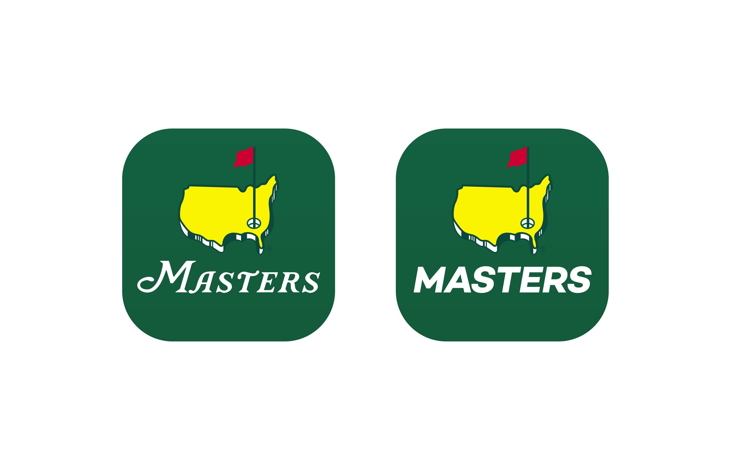
We were curious what the Masters logo and brand would look like if they followed current design trends and went toward a sans serif logotype versus their iconic serif logotype. Think Google, Target, Spotify, Amazon, Facebook and more. The Masters icon is even more iconic than their logotype so we wanted to keep the mark as is. Just for fun, we wanted to incorporate the sans serif logotype into the brand.
This is a passion project and in no way connected with the Masters and Augusta National Inc.
LOGO REBRAND
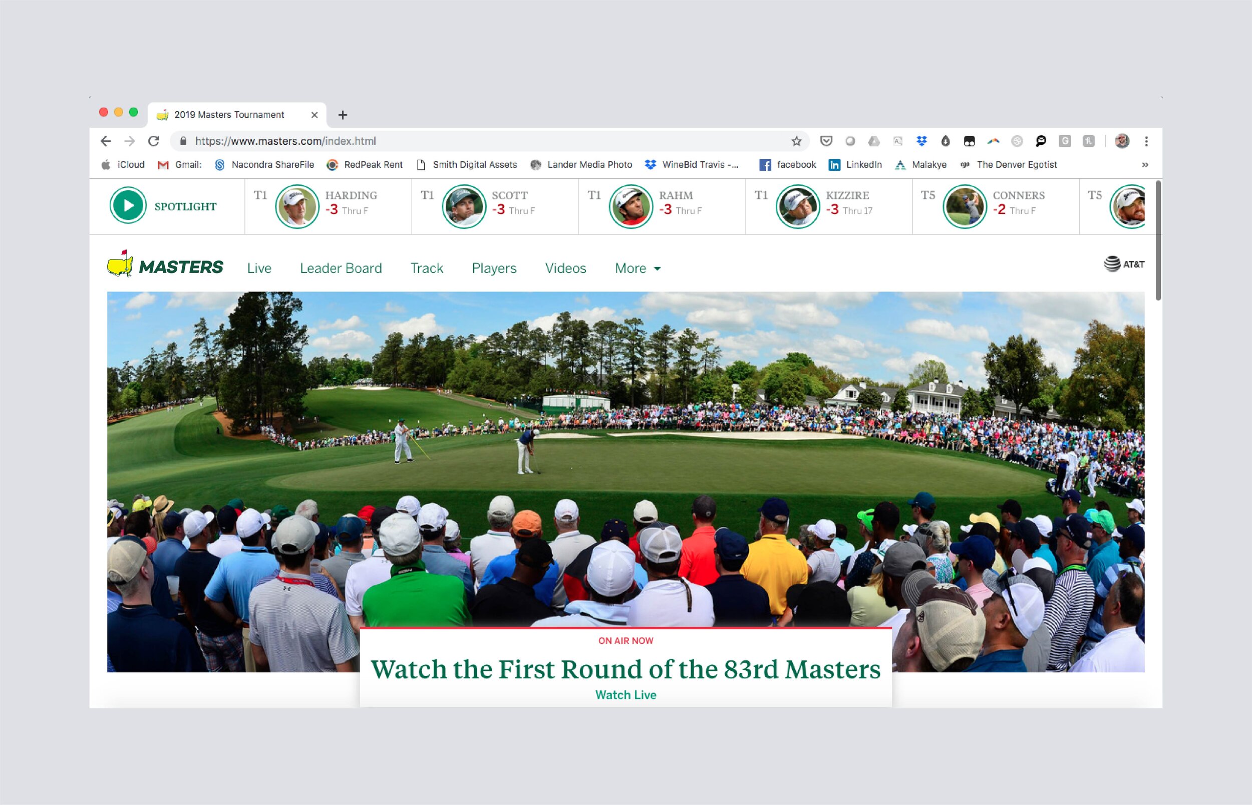
BRAND AUDIT
CREATIVE CONCEPTS