Bollinger Motors Rebrand Design
Bollinger Motors, based in Detroit, needed a new logo and held a logo contest for a new brand mark to represent them. Bollinger Motors' goal is to set a new standard for trucks.
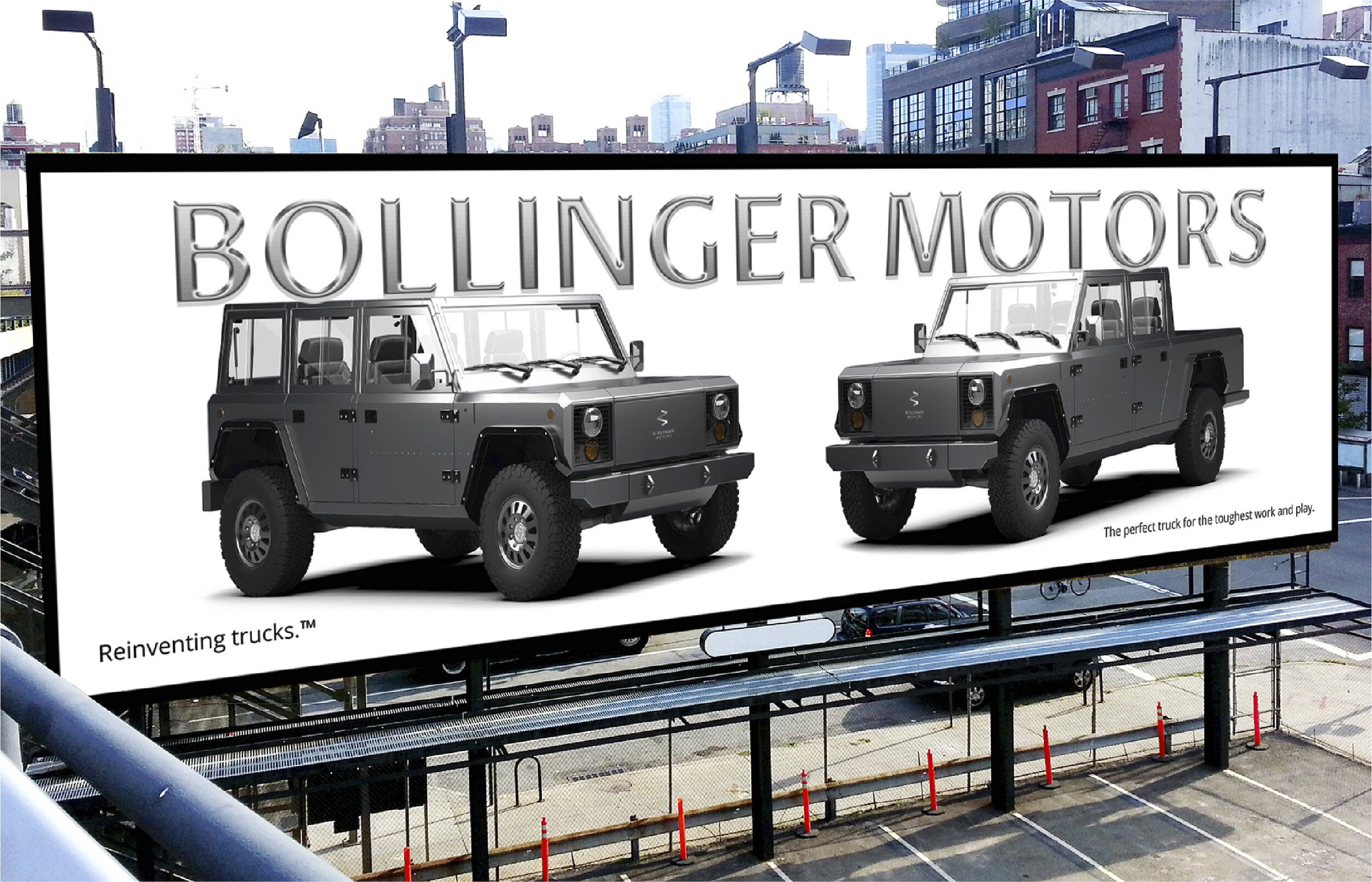
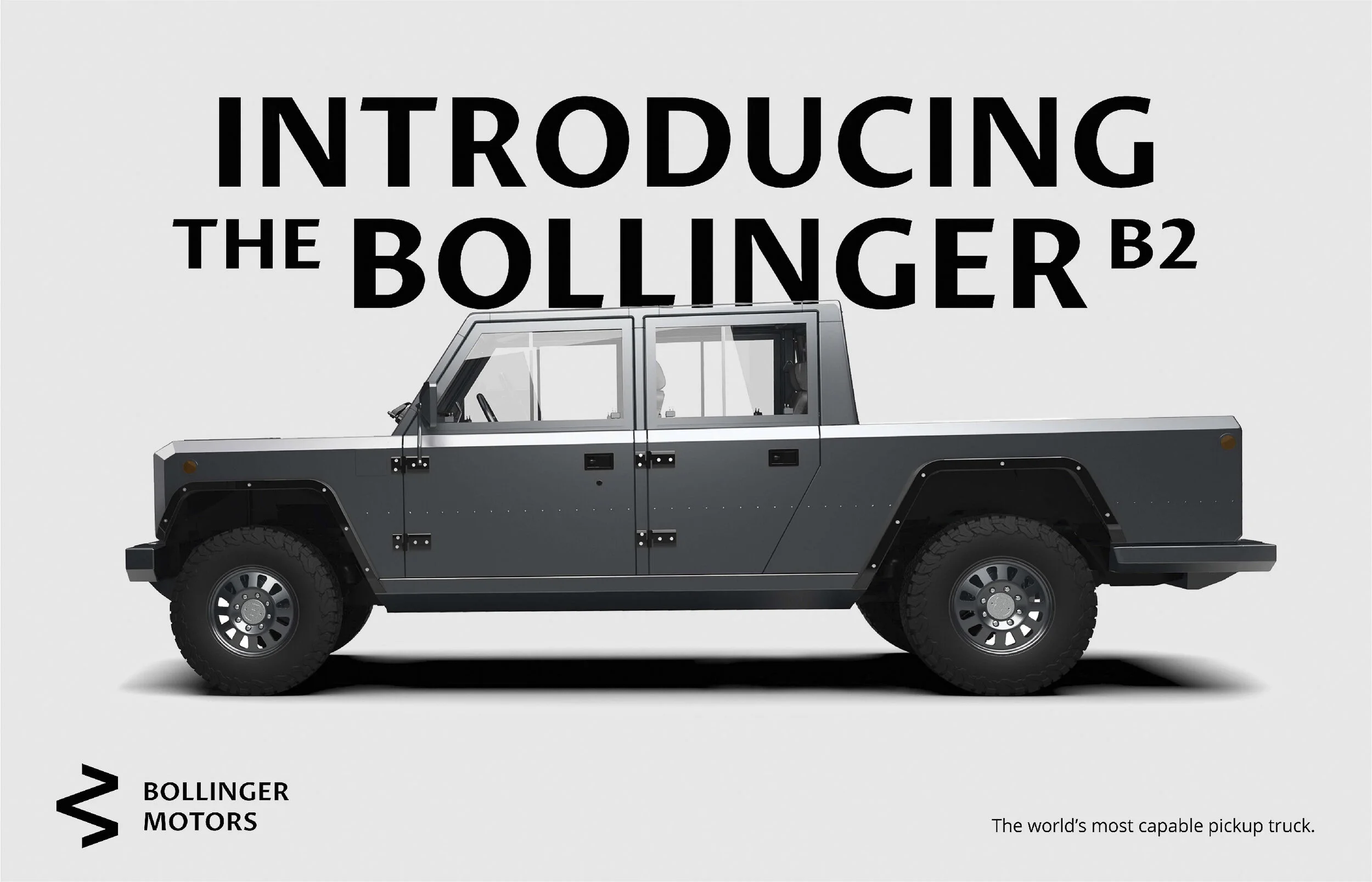
They designed and built an electric 4-wheel-drive truck from the ground up, creating a new platform of electric trucks capable of exceptional off-road performance. The end result is the perfect truck for the toughest work and play anywhere on earth.
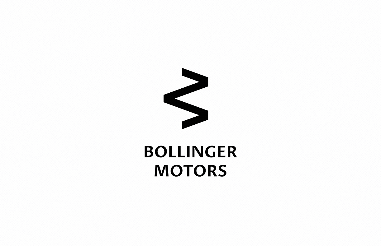
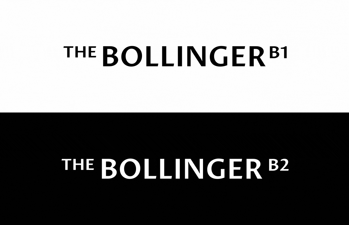
The opportunity to design a new logo for Bollinger Motors was too good to pass up. Even if they did not choose our rebrand concept and design, what a cool project to have in our portfolio. We started by scouring the auto industry and dissecting current design directions and trends. We chose a new strong sans serif typeface that was timeless and easily readable across all touch points. We then created a mark that represents movement and electricity. The letter B is a double read as an M when rotated, and might read as a B or M on rims and a steering wheel. The heavy black color palette leads at all times with an accompanying pop of orange for call to actions and other brand enhancements.
BRAND IDENTITY
LOGO REBRAND
BRAND VOICE & MESSAGING
BRAND AUDIT
PRINT & COLLATERAL DESIGN
MARKETING MATERIALS
PRODUCTION & OOH
CAMPAIGN DEVELOPMENT
MESSAGING & COPYWRITING
DIGITAL & SOCIAL CONTENT
ADVERTISING CAMPAIGNS
CREATIVE CONCEPTS