Ad Club Colorado Rebrand Design
The Denver/Boulder based Ad Club chapter approached us to work with their team to update their identity in order to make their brand feel more sophisticated and unified.
Using strong elements from the existing Ad Club brand (including bold shapes, typography and blocks of color), the Ad Club icon became the focal point of the confident and flexible system that now serves the clubs marketing and advertising needs.
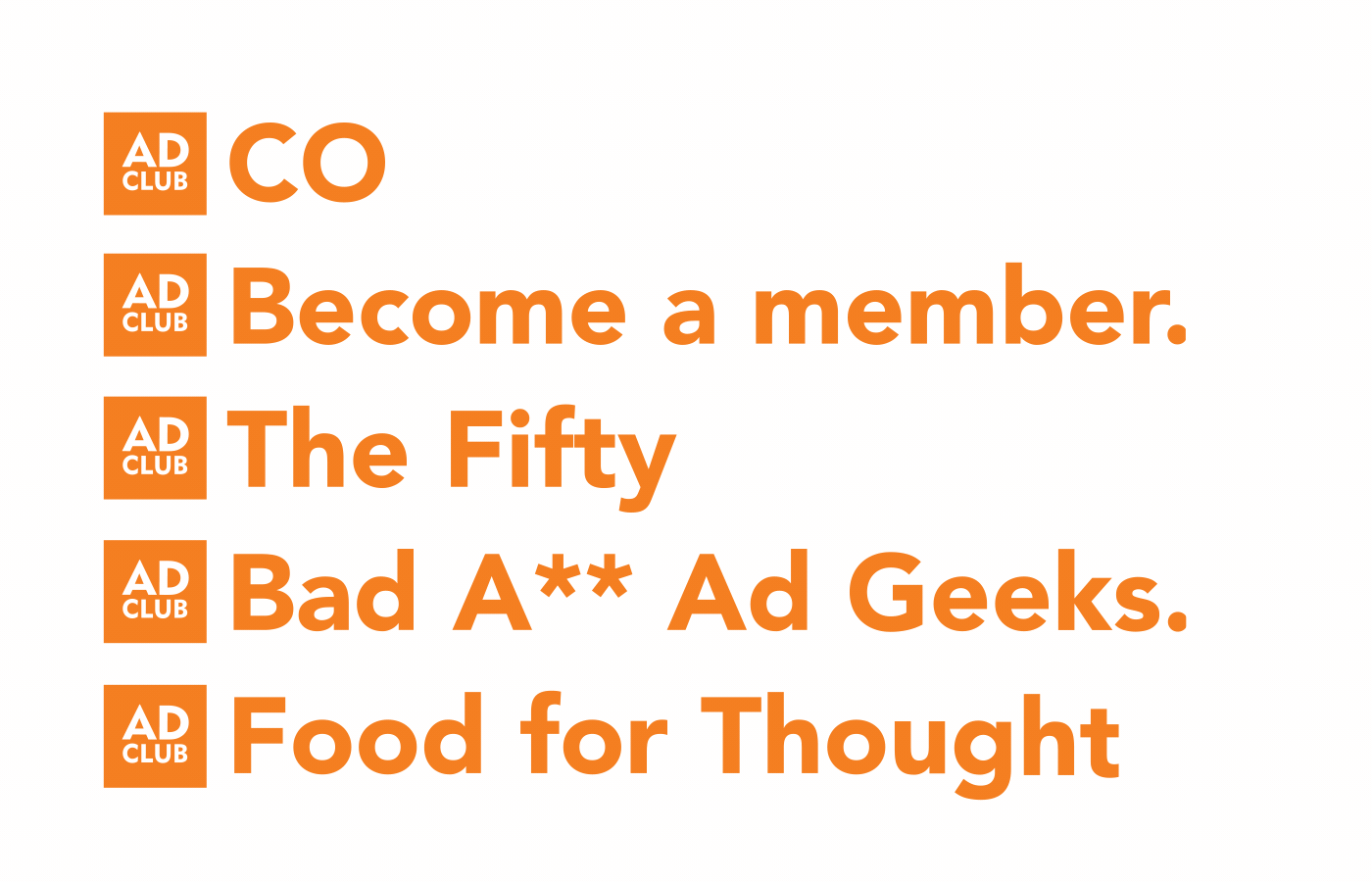
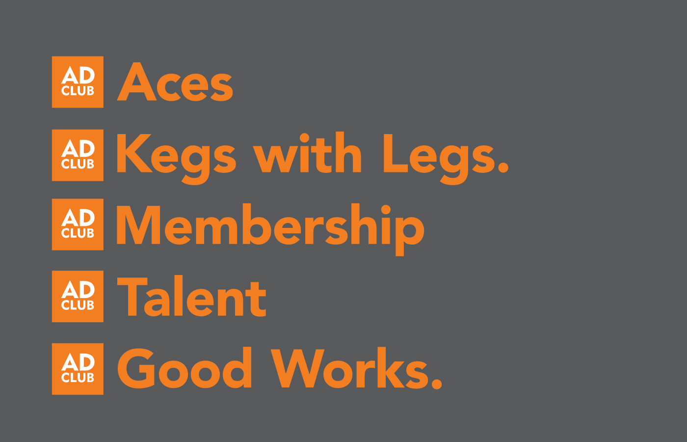
We focused on creating a bold system that is centered around the square Ad Club mark. The Ad Club mark serves as the home base and will be represented on all touch points and documents. Matching the height of the Ad Club mark, we created a system where Colorado can live. Other club text such as initiatives, events, tag lines, etc. can also live in that space when necessary. Moving forward, the typography will be the front runner across all collateral and communication that may exist.
BRAND IDENTITY
LOGO REBRAND
BRAND GUIDELINES
BRAND AUDIT
PRINT & COLLATERAL DESIGN
MARKETING MATERIALS
PRODUCTION & OOH
APPAREL DESIGN
MESSAGING & COPYWRITING
DIGITAL & SOCIAL CONTENT
ADVERTISING CAMPAIGNS
CREATIVE CONCEPTS